I have been using Photoshop for almost 20 years and even though I still don’t use it anywhere near its full potential, Photoshop has become my go-to solution for anything graphic. When I recently had to create my first infographic for the Myanmar Shelter Cluster, this turned out to be the wrong choice.
Pixels vs vectors

I knew the theoretical difference between programmes that manipulate pixels, such as Photoshop, and software that works with vectors, i.e. shapes, such as Illustrator/InDesign, but so far the difference had been largely meaningless to me. Since I’m not a designer and never wanted to draw anything, I didn’t think this was really important. It turns out that, that it is important after all because it is a difference that also affects the text.
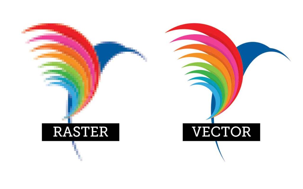
To put it very simply, vector-based programmes treat objects as shapes and the software “knows” what the shape looks like. If you scale a vector graphic the software will fill in the blanks to make sure that it always looks like it is supposed to. That way a circle will always look like a circle and won’t have any rough edges, even if you scaled it a lot.
Pixel-based software on the other hand doesn’t care about the shape you are trying to manipulate, it just scales the pixels you have selected and does not fill in any missing elements.
What I hadn’t realized was that when it comes to very small text, Photoshop doesn’t have enough pixels to render the text smoothly. I don’t really understand this, since text in Photoshop is an editable object and Photoshop should be able to dynamically adjust the pixels. My feeling is that this is an artificial limitation that Adobe leverages to get more people to buy Indesign or illustrator.
The problem was that I didn’t have Illustrator, or money in the budget to buy it.
Direct comparison
To show you the difference between small text rendered in Photoshop and in vector-based software, please look at the following two images. In both cases, the image has been scaled to 300 per cent.
Alternatives to Illustrator and InDesign
Like all Adobe programmes, Illustrator and InDesign are really expensive so I needed to find cheaper or free solutions to create the infographic. In the end, I settled on two programmes:
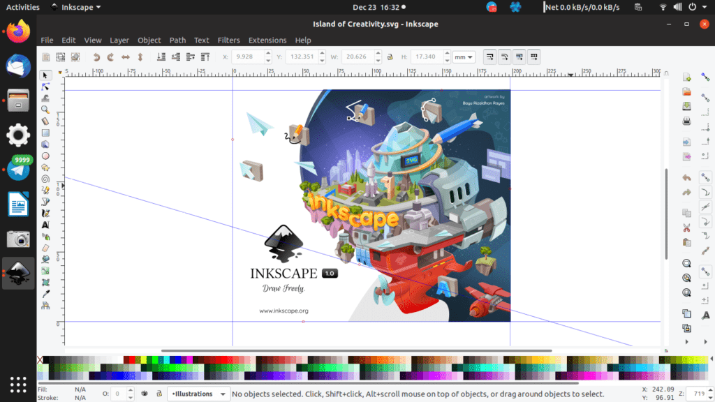
Inkscape

Inkscape is a free vector graphics editor and a free alternative to Illustrator. I used it mainly to colour and scale the graphic elements I had used in the infographic such as the burning house or all icons of people. It’s not the most user-friendly programme, but it did the job and there are a lot of helpfiles and tutorials online so I could easily google any problem I had.
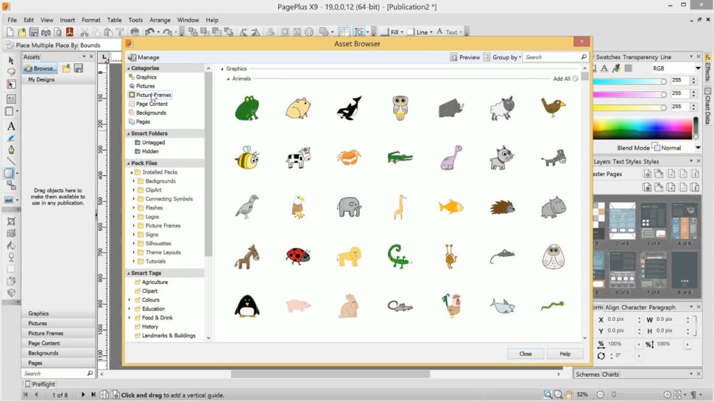
Serif PagePlus

Serif PagePlus is an alternative to InDesign, i.e. it is mainly used to arrange elements on a page for publication, but it also includes simple vector-based shape and text tools. I used PagePlus for all the text and borders in the infographic. PagePlus is not free – the regular price is 95 Euros, a fraction of what InDesign costs but still real money. However, a free starter version is available and while the free version wasn’t sufficient for my needs, it still saved me a lot of money: if you install and register the free version, you quickly get an email or two encouraging you to upgrade to the full edition (it definitely happens within the first 30 days). The good news is that this email comes with a discount of between 30% and 50% per cent on the retail price. I tried the same tactic with another Serif product and it worked the same way.
Anyhow: that’s how I got around the limitations of Photoshop. I hope you found this useful.

